Here’s an example of a frustrating experience when clicking on a link to a post or update on LinkedIn. This could be from someone emailing you a link via LinkedIn’s “share” function, or, as in my case, I had saved a link to a post and clicked the link a few weeks later. The very first window you see after clicking the link is just fine. However, what happens afterward is very frustrating.
In many cases where content is hidden behind a paywall, there’s a jarring break in continuity, where at some point in the process, the website forces you to pay, join, or sign in. This is always going to be frustrating on the part of the user. However, even though LinkedIn’s “paywall” is actually free, I think they’re handling it very poorly due to the website behaving in an unexpected way.
In this case, I clicked on a link I had saved in the past, to a post a friend made announcing that his building has space for rent. Watch what happens next.
Screen 1: initial page with most of the expected information.
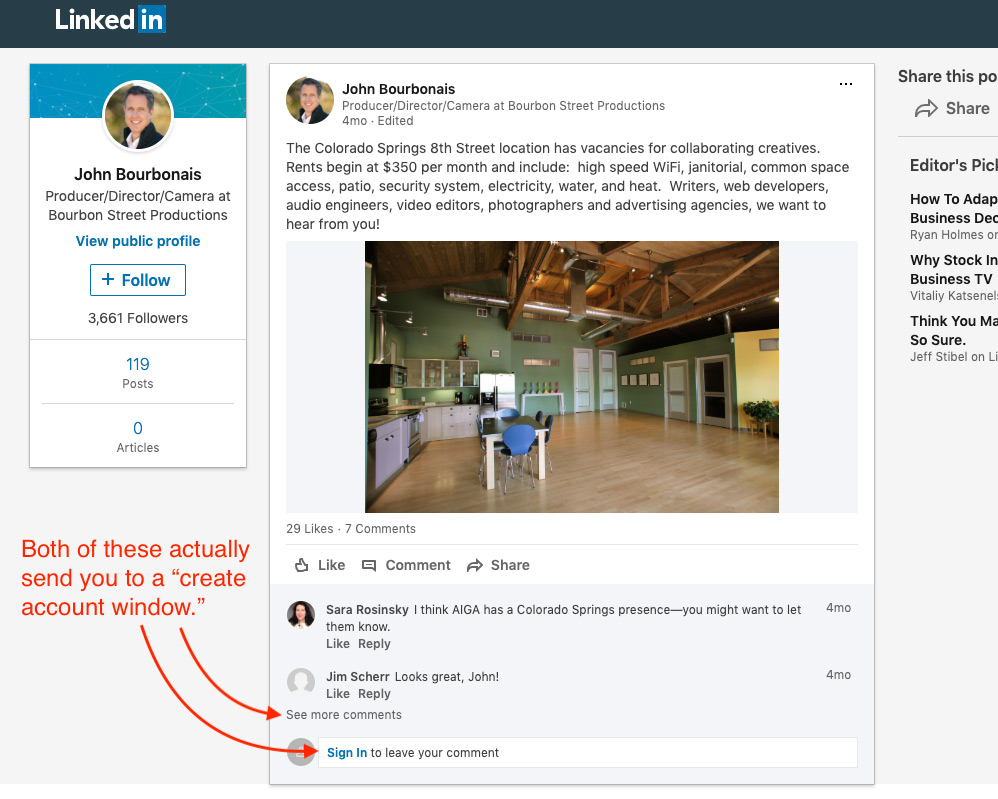
However, in this case, I wanted to view some of the comments people made on the post. Here’s where it gets awkward: since I wanted to see more comments, I clicked the link that is literally titled “see more comments.” Was I able to see more comments? No! I was taken to the following screen, which says absolutely nothing about comments at all, but asks provides me with a way to “join” LinkedIn.
Screen 2: LinkedIn sign up page for creating a new account.

This is highly unexpected behavior because it does not follow that “see more comments” would make me create an account.” What’s worse, not only does clicking “see more comments” send me to this “create account” screen, clicking “sign in” also sends me here. But that makes even less sense, because the link text “sign in” is extremely descriptive: it’s an explicit request to “sign in,” not “create an account.” If I indeed have a LinkedIn account, I have to click “Sign in” a second time on the “Already on LinkedIn?” section at the bottom of this window.
Screen 3: LinkedIn’s “Welcome Back” window for signing in to your existing account.
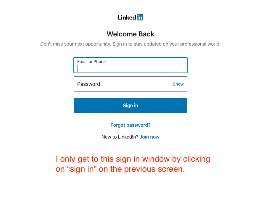
Finally, I’m now seeing the window where I get to log in, since I already have an account. But it’s providing bad UX since I had to click “sign in” twice to get here.
Screen 4: Initial page with all of the info I wanted.

Now, on this fourth screen, I finally do get to see the comments I wanted to view in the first screen. But it took me three extra screens to get here, and I had to log in.
Conclusions
This whole “I’ll show you 40% of what you want then force you to log in to see the rest” action is by no means unique to LinkedIn. Most of them are very unfriendly to users, so that’s not a big surprise. But in this case, LinkedIn’s particularly confusing way of handling what is actually very clear and descriptive language is unusually frustrating. LinkedIn can (and should) do better.
Need Website Help?
Lieder Digital has been designing and building websites and offering digital marketing services for over a dozen years. If you’re looking for a new website, or want to harness the power of the internet to take your business to the next level, get in touch today and we’ll provide you with a free, no-obligation proposal.
Ron Stauffer is a web developer and digital marketer who has spent over 18 years working in the digital marketing field, building websites, creating marketing strategies, and growing revenue for businesses across the USA. His motto is “data wins arguments,” and he tracks everything to prove the value of his marketing efforts for clients. Connect with Ron on LinkedIn or visit Lieder Digital online.